News

28 September 2023

Solar energy …

Some climate models provide a measure of solar energy (short wave radiation) (measured at ground level in Watts per metre squared). With a bit of maths you can determine the output of a solar panel. In a lot of the world you can see a marked difference between the energy reaching the ground in summer versus winter in a sinusoidal curve through the year (left picture). In some places like Singapore, clouds and other water vapour in the air block much of the energy from reaching the ground (right picture). Climate change has the potential to increase this blocking effect, reducing the solar energy available.

Left image: short wave radiation 2030-2035 in London (51.5°N, 0.1°W)

Right image: short wave radiation 2030-2035 in Singapore (1.35°N, 103.85°W)

Short wave radiation plot for London and Singapore.

22 September 2023

Formats …

If you want to look at climate data you might want to see how parameters change over time, get data to train an AI model, see a map of a region, import data into spreadsheets or even see a movie of changing seasons on a map. That’s why we support native plots, json, maps, csv, animated maps and because we are nostalgic, xml, all direct from the API. Also you can create stunning images of the maximum temperature in northern Africa in early 2050 in a few seconds

Max temperature in northen Africa with alr downscaling and key.

15 September 2023

Lapse Rate …

When you go higher in the atmosphere, say up a mountain or in a plane you notice it gets colder. This is called the temperature lapse rate. The rate of cooling with height varies but in aviation an approximation 0.0065℃/m is used. In the API we use detailed global terrain data and the lapse rate to downscale (increase the resolution) of surface temperature model data to deliver better results. They just happen to look cool too.

The area around Vancouver with a 60km model (left) and the same model with lapse rate enhancement (right).

Two temperature maps of Vancouver area with and without alr downscaling.

12 September 2023

What climate change looks like in data

Most of us have heard of climate change but few of us get to see what that looks like in data. One way of looking at climate change is through the change in temperature in a simulation of the earths atmosphere. The simulation were are looking at here is the UK Met Office UKCP18Global model.

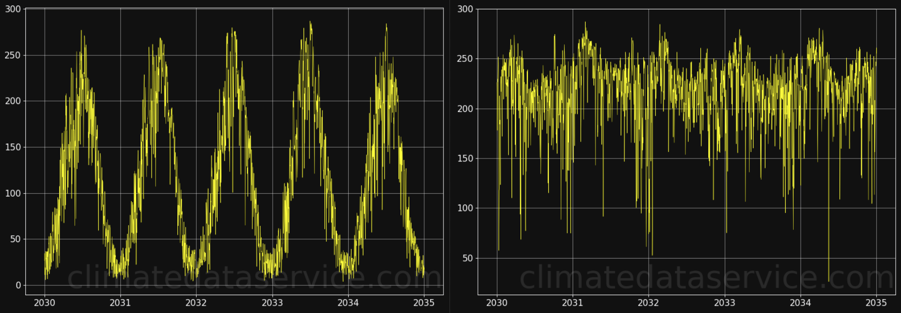
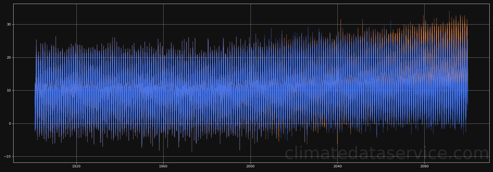
Temperature values in London

The first plot shows the temperature for two scenarios and fifteen models. A scenario is a set of assumptions put into models and are often categorised by the Representative Concerntration Pathway or RCP which makes simulations more suitable for comparison. The two scenarios shown here are RCP2.6 in blue, which represents the "very stringent" case where CO2 emissions are in decline by 2020 and RCP8.5 in orange where emissions continue to rise. The RCP8.5 is often considered to be the realistic worse case scenario.

Temperature plot of 2 scenarios 15 models for London.

How do we know the models are any good

The atmosphere is a chaotic system and it is impossible to accurately predict the weather more than a few days in advance. However, we know intuitively that there are more cold days in winter than in summer. It is both possible and useful to build scientific models that are statitically precise without being an accurate forecast of any specific single day. These models make predictions and can be tested against the statistics past weather observations. For example, the proportion of days colder or hotter.

So while the models are useful and statistically accurate, they produce a range of values for any date. This shows a measure of the uncertainty in the climate data.

Still can't see anything

It is hard to make any specific statement based on the data in the first plot but if, for every point, we calculate the mean value based on the previous two years we can start to see more clearly.

Temperature 2 year rolling mean plot of 2 scenarios 15 models for London.

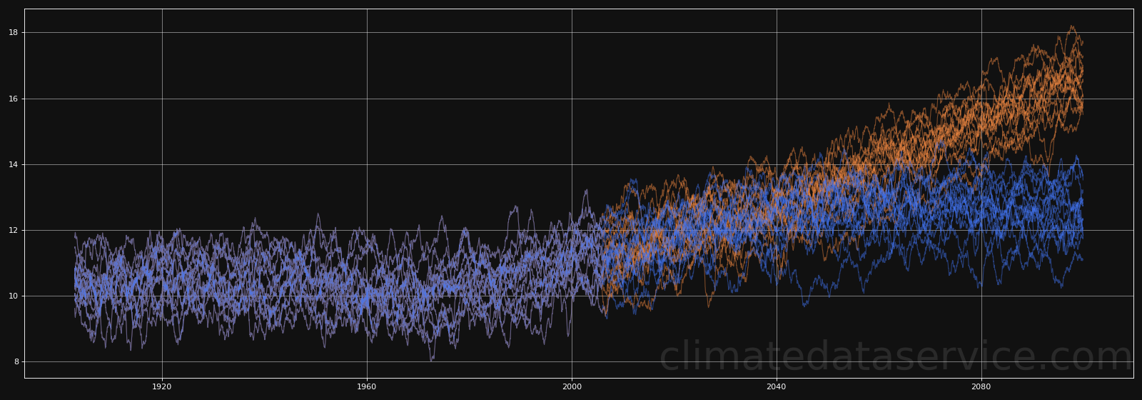
Now what does the data say?

With a two year rolling mean of the same two scenarios, RCP2.6 in blue and RCP8.5 in orange, each with 15 models we see several things. The models don't agree precisely but the trend for the orange RCP8.5 lines is a significant increase in temperature over time. Even the blue RCP2.6 show a general increasing trend. This is what climate change looks like in data.

Having on demand access to data allows users to investigate these changes in more detail and determine the impacts on their organisation. If you would like to know more, why not drop us a line.

8 Septmber 2023

The rationale for a climate API …

Understanding climate change is critical for organisations, public and private. However, climate data has always been difficult to access and hard to work with. There is no central catalogue of data and it is generally available only in bulk. It often comes in strange formats with specialist taxonomy, conventions and syntax. If you have oodles of bandwidth, free time and disk space then no problem, for everyone else, we thought an on demand API might help. We’re getting ready to launch the next version of our API with the ability to plot, process, compare, map, animate or simply retrieve global data in useful formats. Now you can get climate data on any device at any time just the way you need it. Temperature map with numbers overlayed

Cookies

Climate Data Service uses Google Analytics which in turn uses cookies when analysing traffic. You can adjust your privacy controls anytime in your Google settings.

Learn more OK